This is something that I’ve been not only thinking about but experiencing myself. The opportunities and problems afforded and created by the addition of different dimensions (mostly in the traditional sense like 2D to 3D but the definition is loose) becomes both amazing and daunting. I’ll keep this confined to map and level design.
Starting with making 2D Flash games, level constraints are quite straight forward. You only have two degrees of freedom (x, y axes). Take for example the ubiquitous platformer: movement is defined by floors. 2D platformers are easy to grasp whether due to its simplicity or its commonplace nature in games. I remember drawing Sonic the Hedgehog levels before I could spell Sonic without looking at the box. Walking on terrain is a simple game that we all know because we’ve played these games as children–skipping over cracks in the pavement, hopscotch, and etc… Creating levels for 2D games are fairly straightforward and are easily produced on paper by drawing simply lines to represent the ground. There is easily a standard for designing with these constraints. The information that is required to effectively convey the workings of a level can easily be read and drawn on a piece of paper for an everyday platformer.

When moving to 3D, there are another slew of possible game designs we can take advantage of. Now we have three degrees of freedom (x, y [limited due to gravity assuming platformer], and z). However, there is still precedent for understanding how 3D games work. As mentioned, we play games like hopscotch in reality–we are platforming in 3D. Instead, we now have access to not only backwards, forwards and up (left, right, and jump in 2D land, x and y) but we also have strafing from left to right (z axis). This is exciting but not without its tradition too. 3D level designs derives from architectural blueprints. You can still convey a lot of easily digestible information on a piece of paper even if terrain height are different. This is because changes in height are discrete, first or second floor. This is mainly due to the existence of gravity, a key constraint. We operate like this every day, we climb stairs to change our height first. Only then do we go backward, forwards, and strafe to move bodies around on the floor that we are currently on. Drawing maps can be split up by discrete floors and still be easily manageable just like reading floor plans of your next apartment. The only places where height changes matter are at your stairs or ramps. Again, the importance lies in that height change (y axis) is discrete–you’re either on the first or fifth floor.

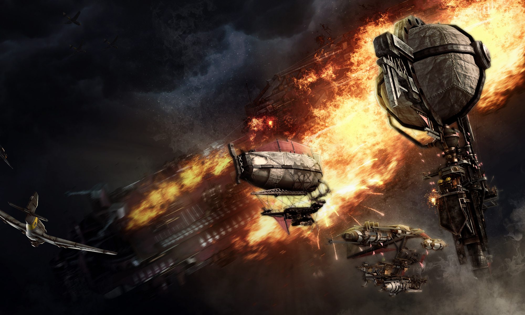
Now, in the case of Guns Online, we have a wide and continuous spectrum of movement within the y axis. While this problem isn’t new, it isn’t very common. Descent, released in 1995, was probably the earliest example I can think of full six degrees of freedom. To quote from the Wikipedia page, “Descent demands that players keep their sense of orientation in a fully 3D environment with a flight model featuring six degrees of freedom in zero-gravity. Traditional FPS games require the player to only control two axes and their heading. By employing six degrees of movement, the player is given additional control for vertical movement and banking, introducing more movement controls than traditional FPS games.” Truth be told, we as humans are bad at orienting ourselves without a proper frame of reference.

Complete freedom of movement would make map design simple. We’d just give you an open space. Done. However, like paths in the dirt, there needs a way for us designers to constrain flight movement as well as not disorient like Descent does. Open space is simply not interesting. Where height changes like floors served as a frame of reference for discrete changes in the y-axis, things are more complicated when those values are now continuous. Presenting continuous information on paper is difficult to read and even harder to draw. The easiest thing to do is to start planning our terrain in 3D instead of graph paper to not only provide us with the ability to see exactly what we’re building but also give us insights to what paper design cannot show us.


Just the fact that trying to draw height gradients on graph paper is enough to deter us but the added truth that you cannot accurately capture something is on top of something else is what pushes the designing towards a 3D toolset. While developing the tools will take some time, iterating upon 3D designs will be much faster since we can quickly see what exactly is going on in the terrain by actually exploring it in full 3D. The complications of continuous y-axis movement in 3D are certainly difficult to wrap one’s mind around them but they are not insurmountable given the right tools.

