Happy Holidays everyone!
We’ve been working hard at Muse HQ to get prepared for our next test phase with a bunch of new content and some major balance changes to make a much smoother Alliance experience. Two massive heavy weapons are coming to the skies including the very requested Heavy mine launcher! We also have a screenshot contest we’re really excited to invite everyone to.
This session will be shorter than last starting on December 27th and ending January 3rd, so make sure you get in early and leave your mark on the history of Icarus.
Follow the jump to See all the notes and see the requirements for our Screenshot Contest!
New content/features:
Alliance Beta (For Open Test Period)

-
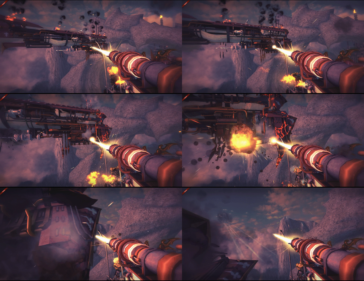
The Heavy Remote Mine Launcher sends a storm of high powered explosives into the sky, daring any to get near them.

-
The Heavy Cavitation Gun fires a singularity, piercing ships and pulling them closer to their destruction.
-
Added alliance specific loadouts
-
Added leader icon for chat
-
A notification appears for officers and leader when player applies for their clan
General

-
Pietro’s veil (male & female) — As a token of appreciation for those who have supported us early. Every pre-order of Alliance will come with this mask
-
Up/down arrow in chat rotates over your sent messages
-
Dead ships are marked on scoreboard
-
On respawn map, the spot is marked where your ship was destroyed
Changes:
General
-
Modified visibility rules to prevent visible from ships popping out of existence in dust clouds
-
Social icons’ optimizations
-
Team tab moved to last in sequence at match end screen
-
Changed mines’ description to less confusing
-
AI that are set to ‘shoot only’ repair the guns they are on
Alliance Beta (For Open Period)
-
Increased the margin for the in match objective text
-
Visual solution for not shooting at barge and friendly outpost
-
Assault Enemy Goal Per Player Count
-
Match-end UI: war chest full warning display
-
Fade in and out AI airship spotted lens flares
-
All faction resource goals are now visible on the world map resources panel
Fixes:
General
-
Mighty Pirate using wrong lines while on helm
-
Player popup buttons sometimes don’t work
-
AI switching guns between each other
-
Map edge gust at low altitudes on Dunes
-
Old thumbs up notification is back
-
No sound feedback when clicking on ship’s name to check loadout in lobby
-
5:4 Scaling too high on menu ui, social panel overlap
-
Blocking players will obscure their name text with the background
-
Player profile popup issue with scoreboard
-
Match chat cut off and overlap on 4:3
-
Vet Matches option on matchmaking menu missing text
-
City Hunter 4v4 initial spawn issue
-
Clan missing levels
-
Blue team’s 1st captain title is sometimes wrapped and truncated
-
Start screen callout text overlaps images
-
Long descriptions for costumes get cut off
-
Removing clan members from clan list does not immediately show them as removed
-
Improved CPU utilization, particularly for large matches. Should result in better framerates for many systems.
Alliance Beta (For Open Period)
-
Defense was not counting the boss in its “Kill all enemies” end goal
-
AI boss and bases not firing guns
-
Chaladon and Fjord baronies description on faction select screen gets cut off
-
Footer menu items misaligned
-
No boss spawn on survival boss wave
-
Hitches/slowdowns when bosses and large groups of airships spawn
-
Erratic rotation for map icons
-
Reinforcement buttons popping up on world map refresh
-
Pressing ESC while looking at a specific territory brings you back to main screen instead of the full map
-
Faction Icon Display in faction selection not displaying properly
-
Hear Charging sounds for longer distances
-
Typo in “Mechanized Rebuild” skill name
-
Laser effect is shortening when it hits your own ship
-
Faction leaderboard ordering was reversed
-
Laser sound effect doesn’t clean up
Alliance Screenshot Contest
We want the community involved in showing off the game in the best way possible. The images you send in will be used to market the game and make up map screenshots (that you see when selecting a map.)
Rules:
-
All images must be from no-UI spectate.
-
Images must express the feel and scope of the map, ships, or game mode.
-
Contributors can submit as many or few maps (game modes) as they wish.
-
Contributors can submit up to three screenshots per map.
-
Screenshots should be 1920 resolution in png file format.
-
Highest settings possible
-
Screenshots must be sent to feedback@musegames.com with the map name as the file name. paritian_rumble1.png for example. Include ingame name.
-
Ends January 3rd
-
Images will be used to promote the game and may show up in marketing materials.
Categories:
-
Maps. Showcases the features of the map itself. Ships and battles may be included, but should not be the main feature of the screenshot. At least 3/4 of the screenshot should be background. Avoid prominent decals and players
-
Ships.
-
a. Pristine: Showcase the ships in the best way possible. Try to keep the shot clear of chem, armor, and buff, and other effects.
-
b. In Action: Show the ships giving or taking hell.
-
AI
-
a. Capital (boss) ships: Show these beasts as they truly are. Try to express the scale of these ships.
-
b. Front line: Give the other ships some love as well. Or hate. Whatever you prefer. Just make it a good shot.
-
Players: Show your fellow players at their finest, in their finest.
Rewards:
Names in credits as contributing ‘photographers’.
A Muse made item from the store.
Title: Shutterbug

