After the saga with the publisher ended, I was pretty demoralized, we all were. But I really didn’t have time to sulk. We were about broke. The money we made from the original Guns and CreaVures was running out. I didn’t really know any publishers, or anyone for that matter, who would give us money. We had just ended a publisher ordeal after all. Looking around the room, I owed it to everyone to keep us going. Making games is what what we always wanted to do. We had sacrificed too much, came too far to just lay down and quit. Really didn’t know what else to do in the nick of time, so I turned to my parents to borrow money, and not a small amount. My parents had always been incredibly supportive, but I was asking for the hard earned money. From then on, I had to carry the weight of the team, but also the debt to my parents, which was probably the worst kind of debt, and the stress of it definitely added to the number of my sleepless nights. To get this far, we had a lot of incredible support, and there’s a lot to be thankful and humbled for.
From the depth of that abyss, the climb was steep but in a way freeing. To know that we once again had complete control of our creative destiny was a big relief. The downside? We started almost everything over. Art wise, we returned to our original vision and threw out 5 months of work– re-concepting and rebuilding an entire art production process and pipeline from scratch. Artists remodeled characters, rebuilt rigs, and updated our entire animation library. We also had to strip away a lot of the functionalities and designs we forced in just to satisfy the publisher. To be more efficient for the future, we did the painful work to re-architect networking and migrated from Smartfox to Photon.
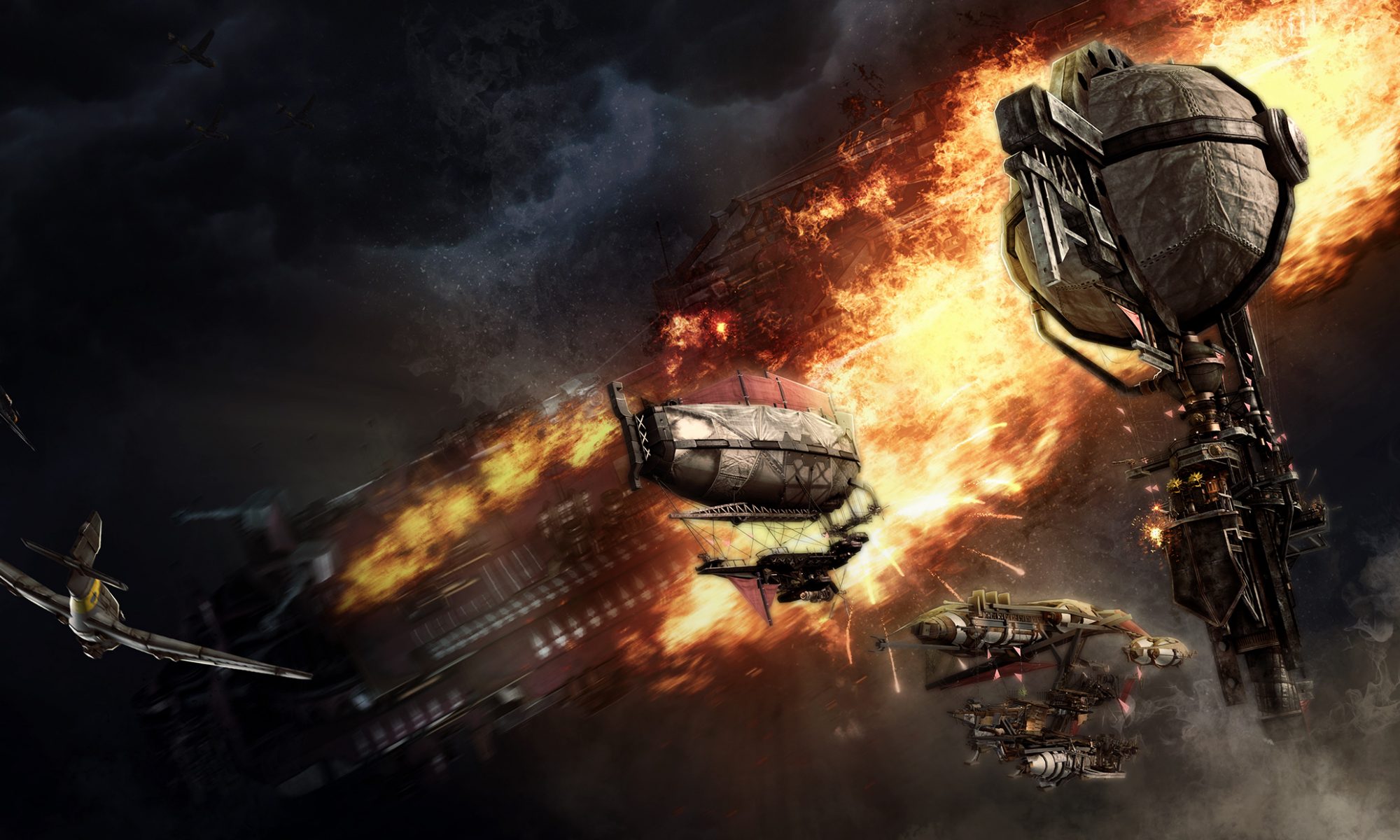
More than just specific implementations, we took a hard look at how we did things fundamentally to improve. For instance, to anticipate the scale and diversity of assets we needed to create, we started to do a better job designing and mocking things up quickly to test before we refined them. Going back to the the starting point of just what was Steampunk to us, what was the color and tone of the world, we went back to the drawing board and created new style guides.
To quickly design and identify assets that would not only fit with the world but also be fun to play and balance, we created an extensive catalogue of silhouettes, drawing references from various inspirations and from our imagination. Interestingly, we picked out the silhouette for the what would eventually be the Spire – one of the ships we introduced into the game in 2013 – in early 2011. As we defined the major player classes in game, we also explored how we can create a distinct silhouette for each class and conform costume and clothing design to it. This way, we tried to use visual language to reinforce design.
Unity allowed us to create digital prototypes fairly easily due to a lot of basic components for first-person games already packaged in the default install. One major game mechanic was difficult to paper prototype in a meaningful way because it relied heavily on player reaction and timing. The Engineer mechanic was inspired by games like Diner Dash where our initial designs sought to reward players at several stages of maintaining a ship’s component (gun, engine, hull, balloon). Managing one component is relatively simple in that it forced a player reaction like using an extinguisher if the component is on fire, then caused a waiting time (cool down) to allow players react to other components, and then a finishing phase where the player needs to reactive the repaired component. Furthermore, reactivating a component with the “perfect timing” buffed the component and forgetting to reactivate meant that the component was sitting idle and unusable. We imagined the most efficient engineering being the one to memorize ship layouts, find the shortest path from each component, and be able to triage the various statuses that the components could have.
The game designer began to hack away at creating a digital prototype to simulate this hardcore time management repair mechanic in the heat of combat. Even though fluorescent cubes blinked on and off like a night at the disco and jarring sound effects screamed louder than Skrillex, there was still a nugget of fun buried somewhere in the prototype so we knew we were on the right track. However, no digital prototype can be expected to be without flaws. There was one glaring issue that we’re glad it exposed. One key factor that made this prototype playable was that the designer gave the player had perfect information—the engineer knew when exactly a component would take some kind of damage. Without perfect information, though, meant that there was too much to react to and everything burned to the ground. Perfect information was something that we had considered giving to the player as an upgrade (like special engineer goggles) but realized from the prototype it would become a requirement. It was ultimately not the direction we wanted to go in and our game designer went back to the drawing board. The mechanic was too hardcore so some phases of the interaction flow were dialled back or axed entirely.
Designs on paper are rarely any good until they’re tested in some form. Ultimately, everything begin with low fidelity (cards, dice, paper, and role play) prototypes but sometimes jumping straight into digital prototypes is required. At the time, it was important to move fast and find results quickly and in this case meant one person going from ideation, designing interaction flow, to digital prototype. A combination of flexible responsibility, knowledge, and Unity’s low barrier to entry made it possible.


